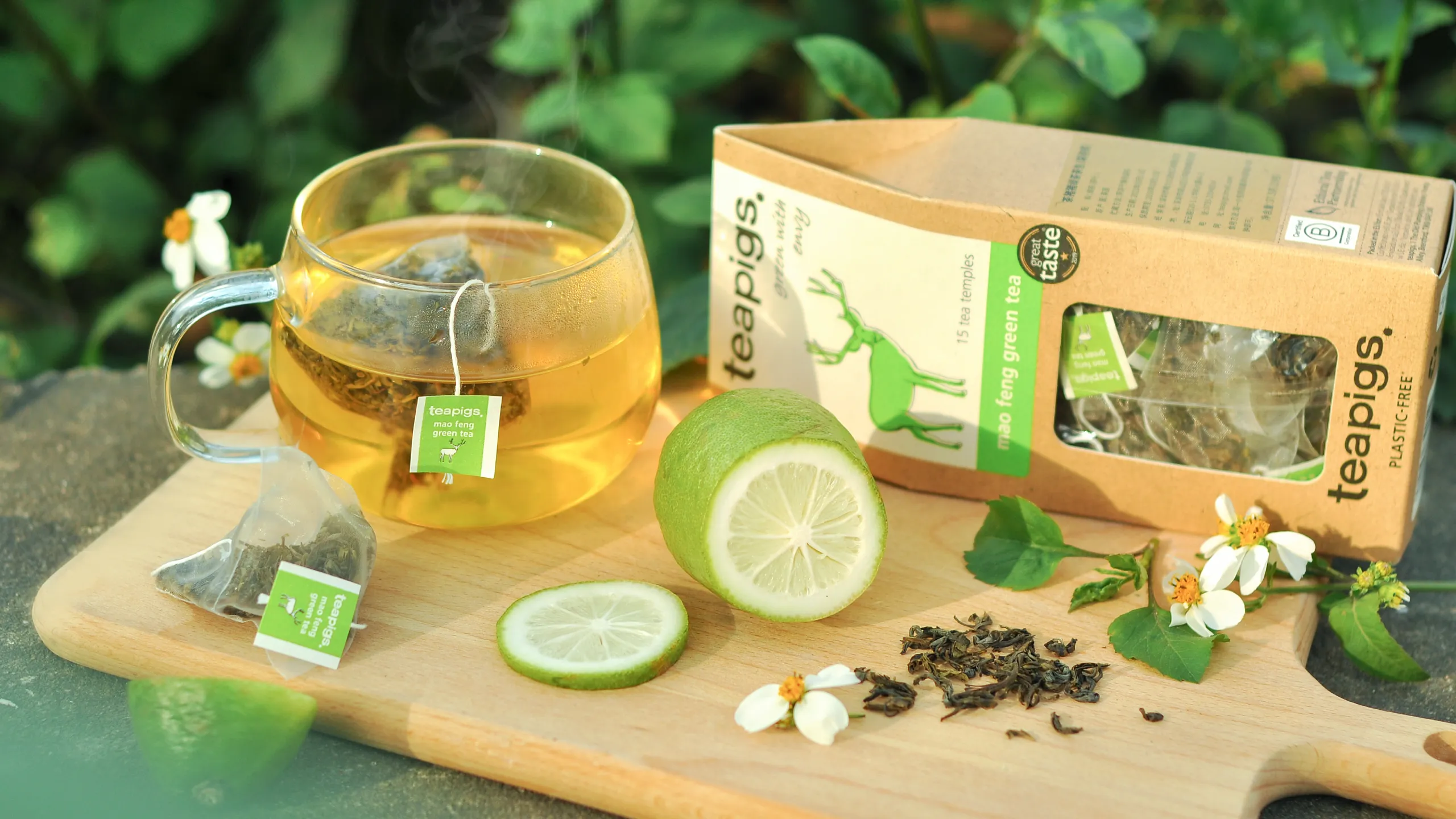
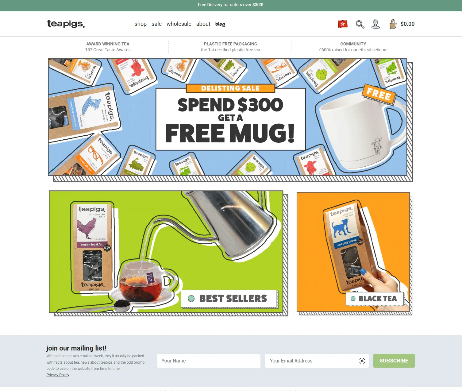
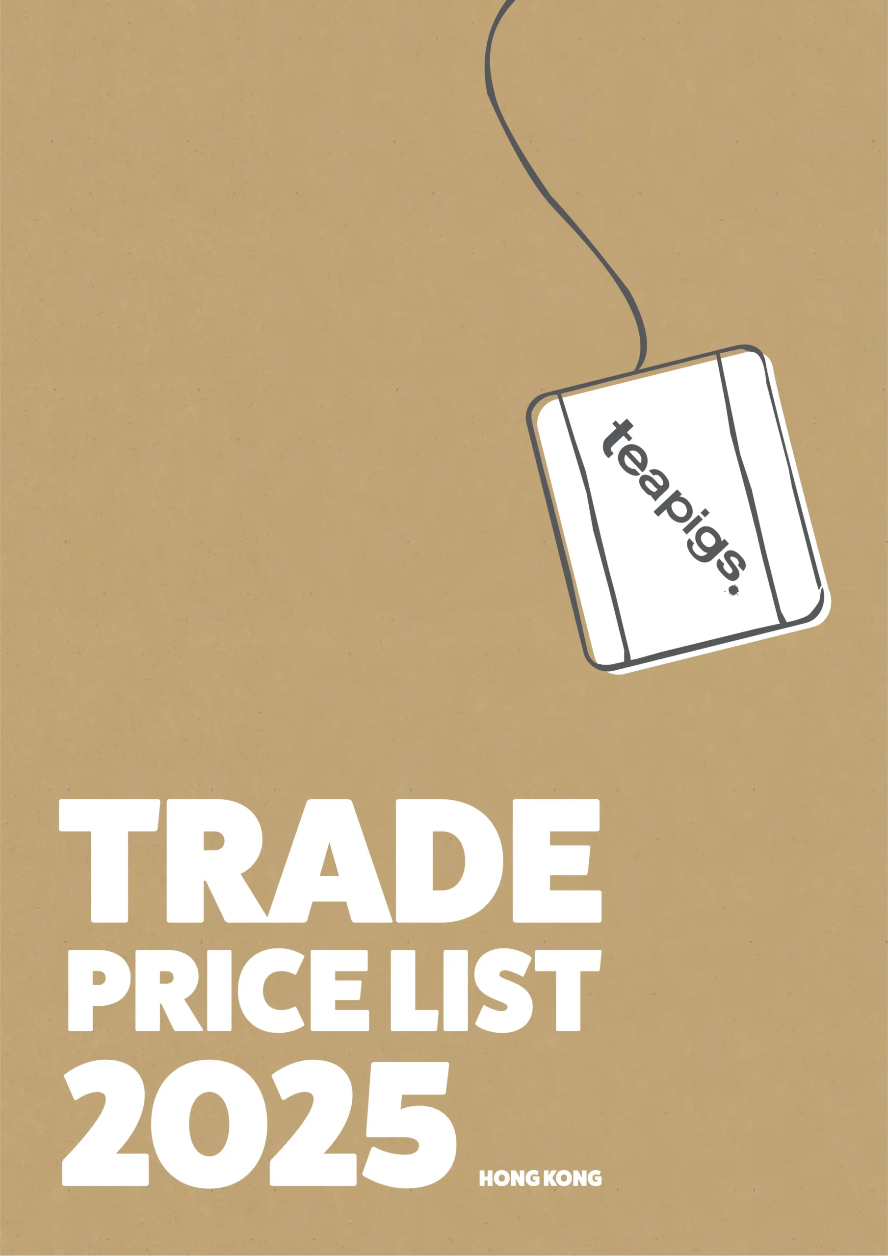
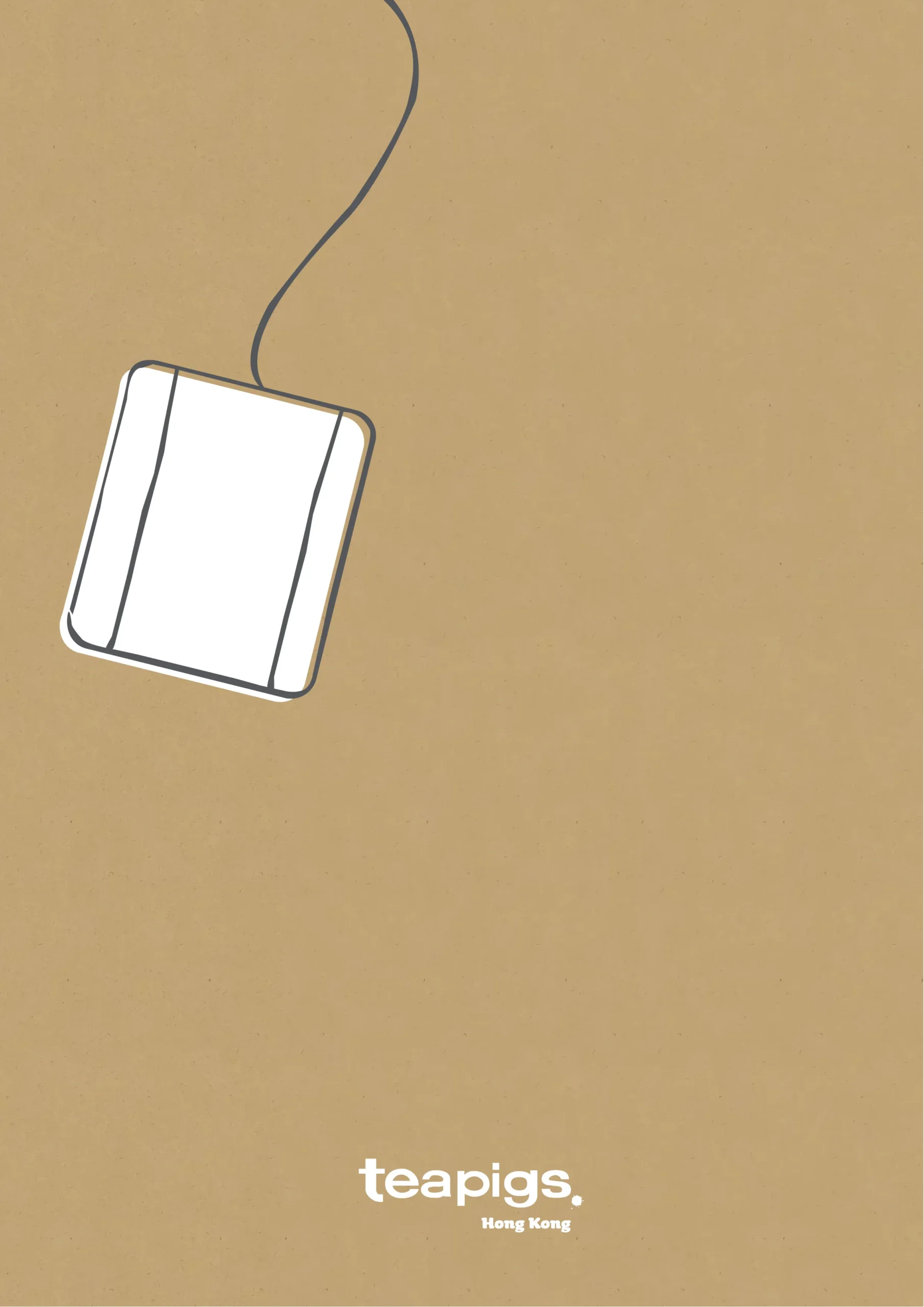
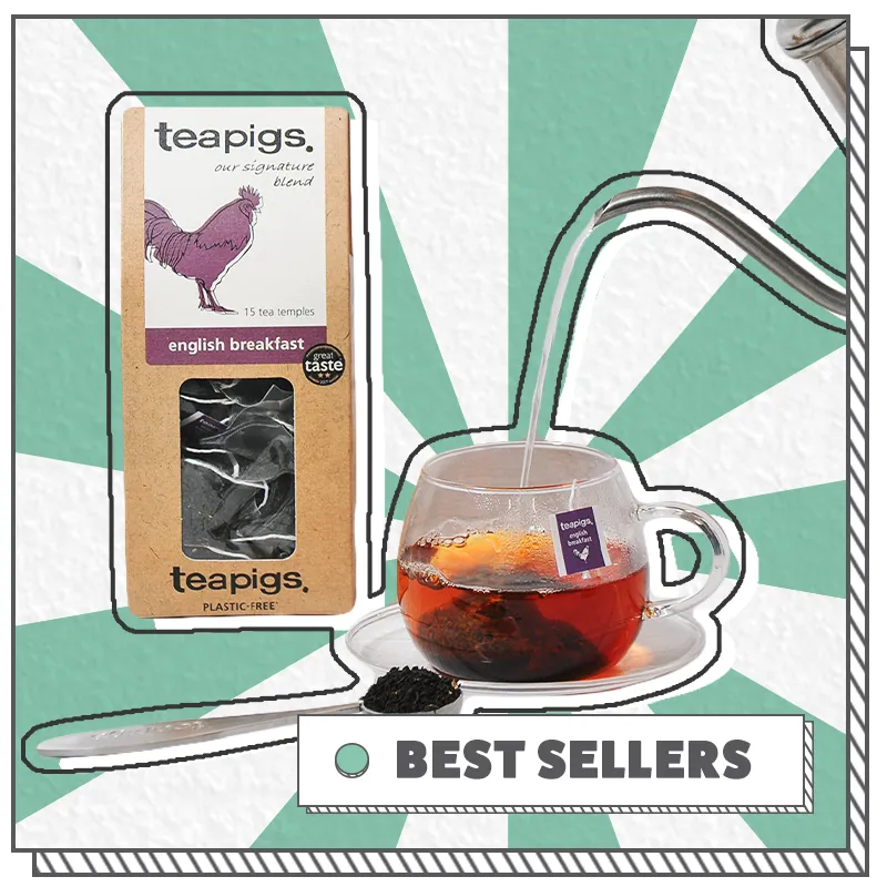
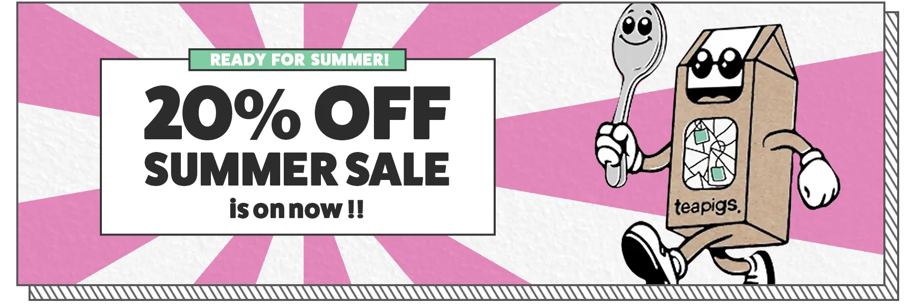
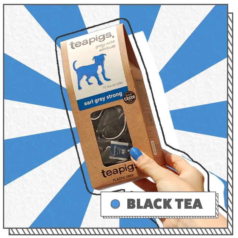
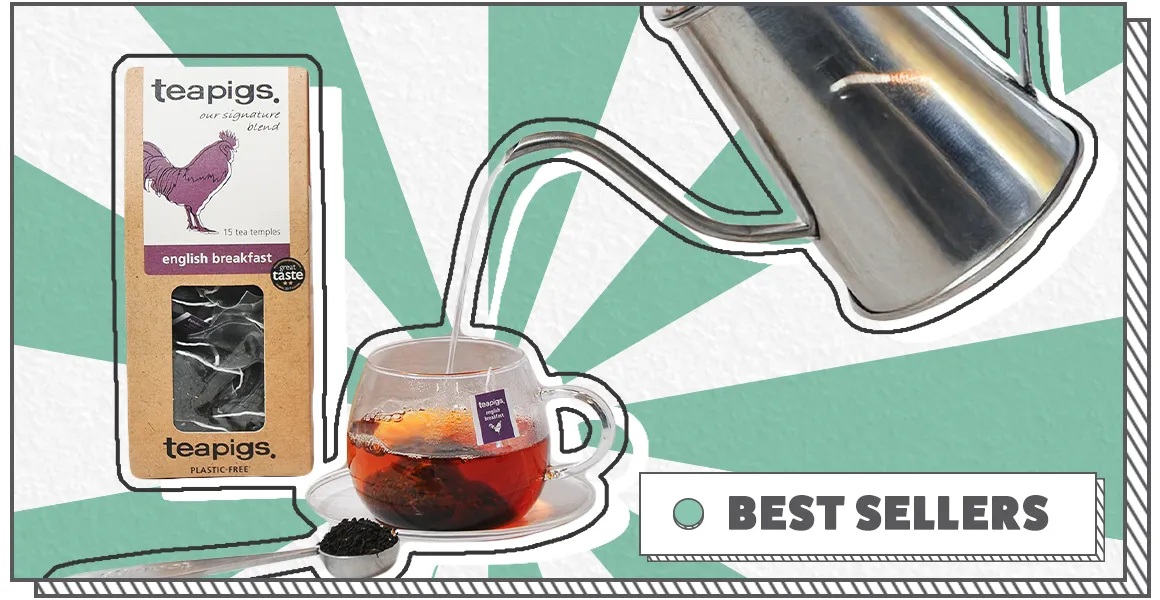
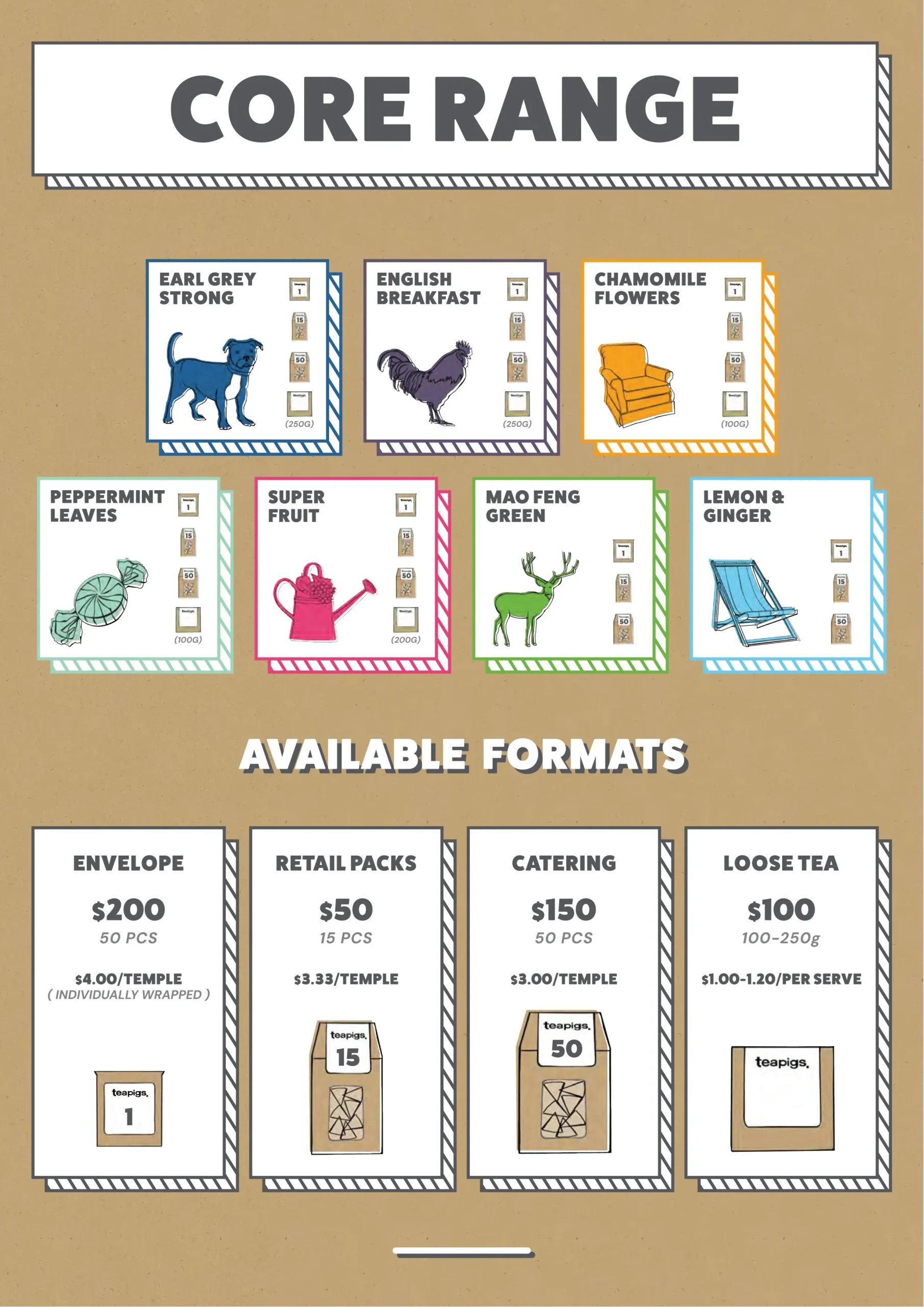
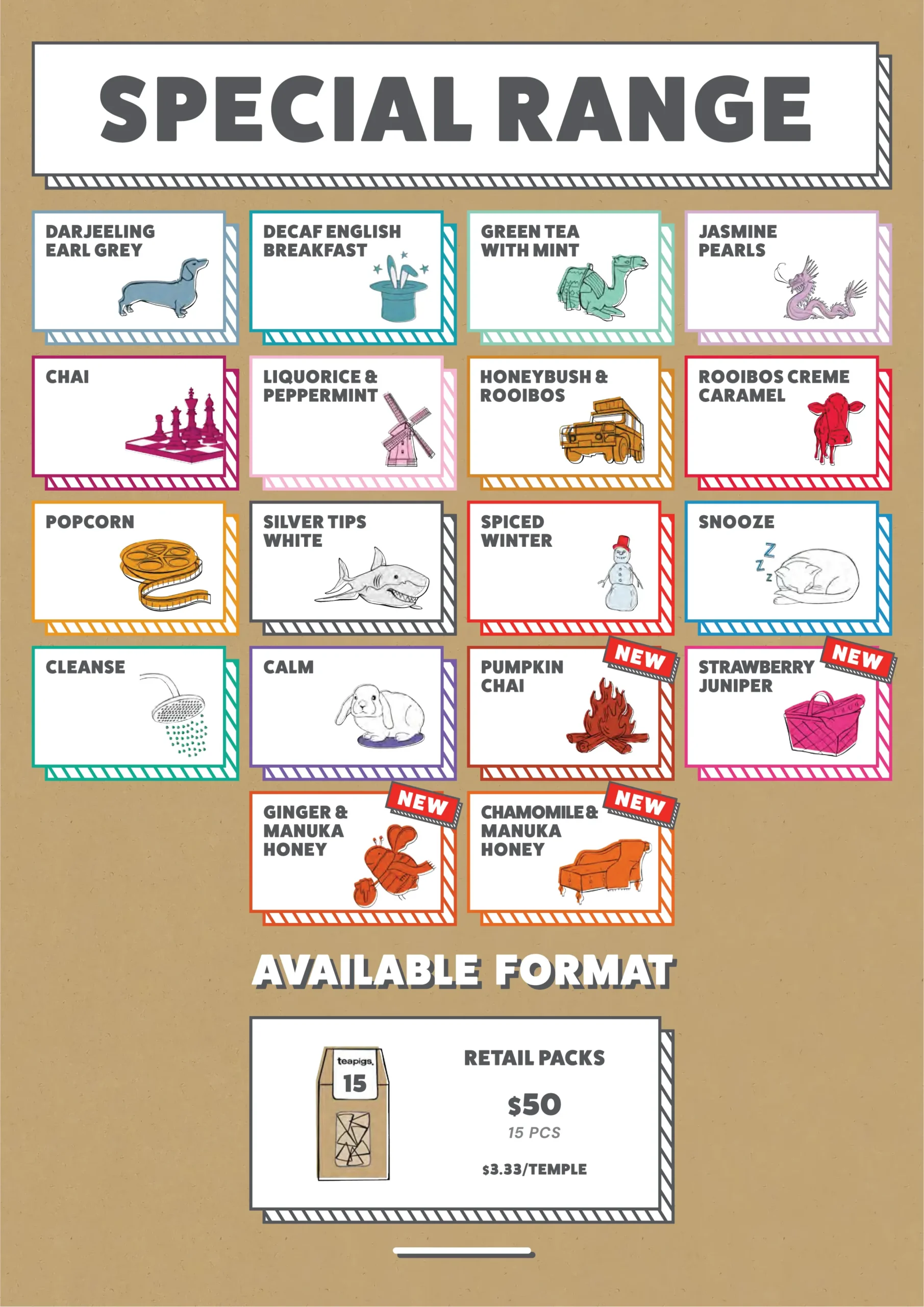
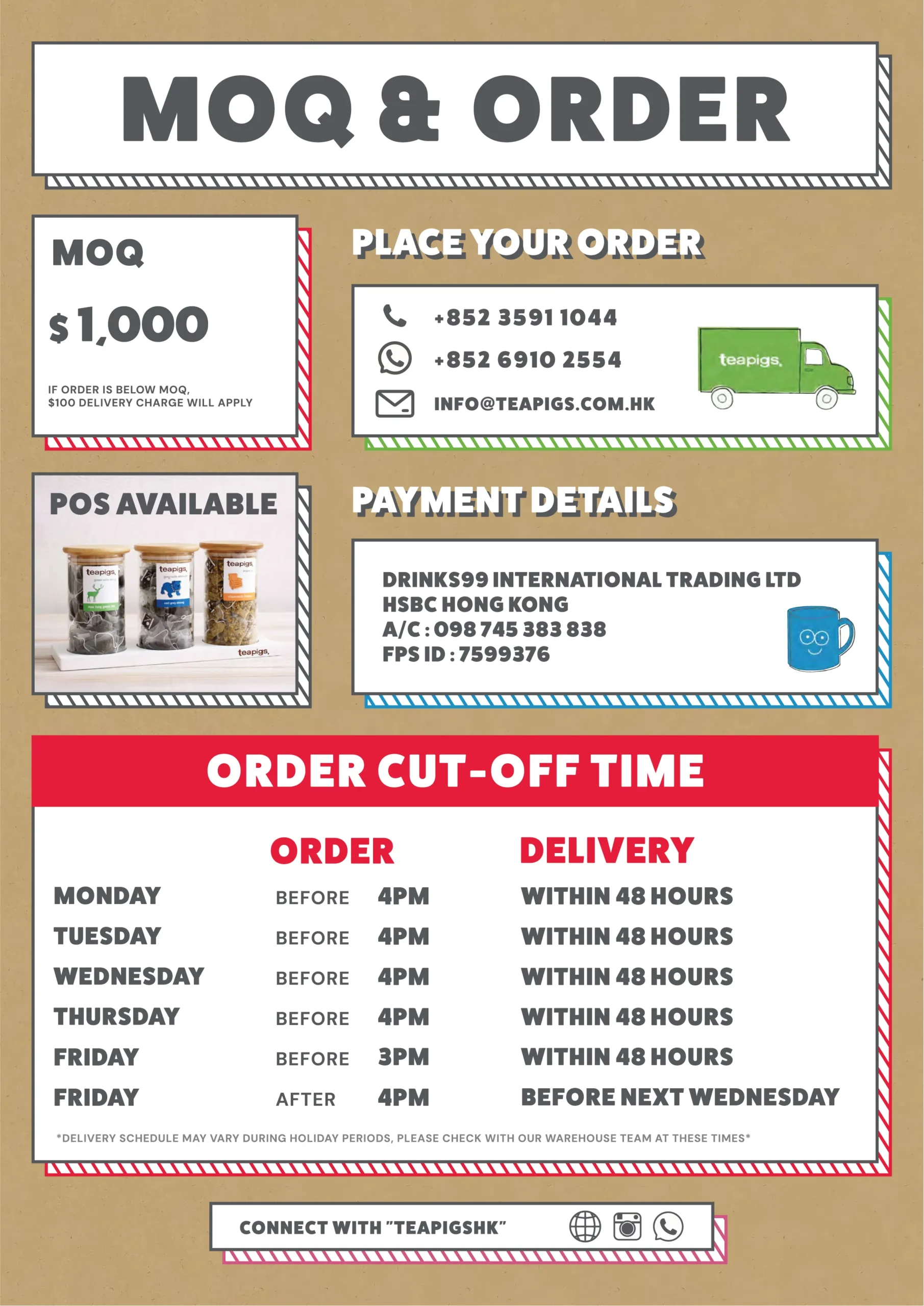
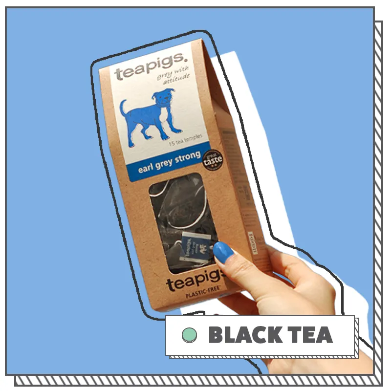
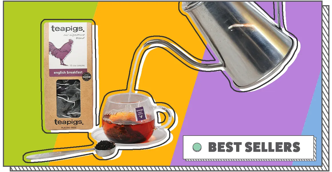
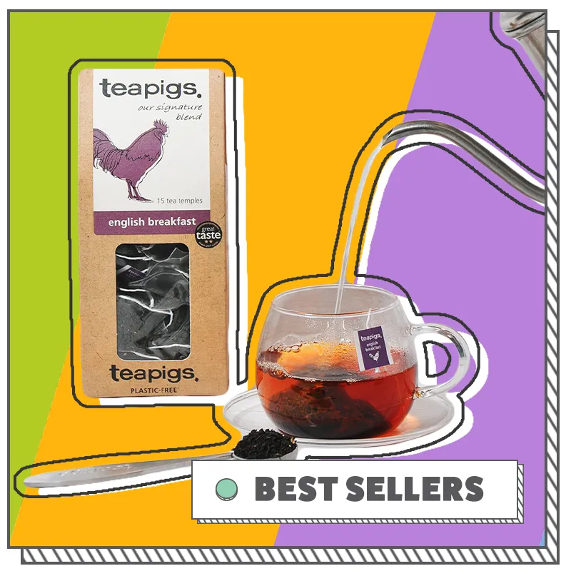
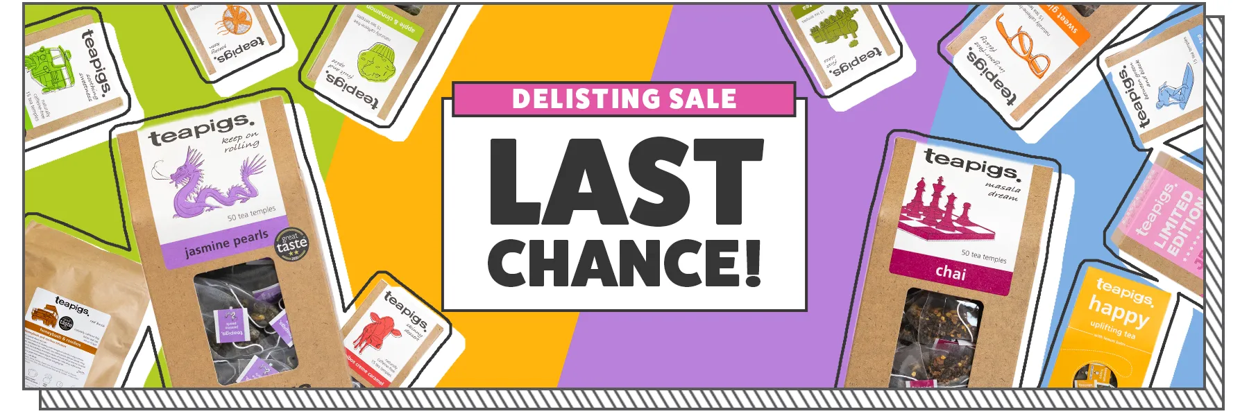
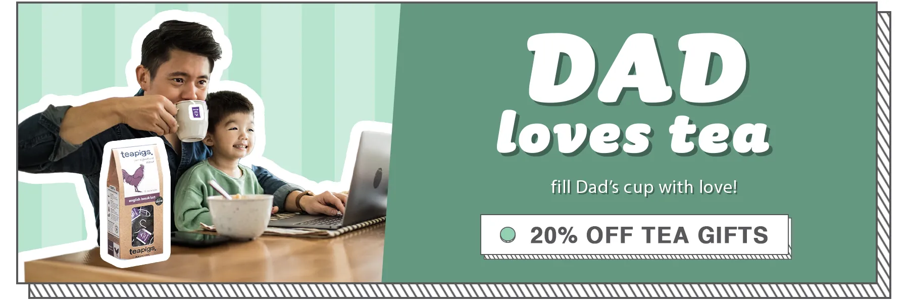
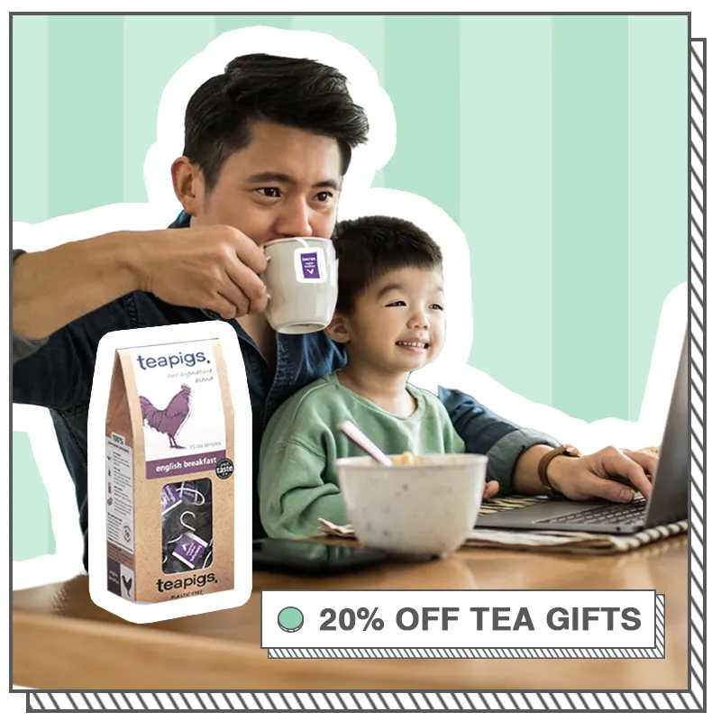
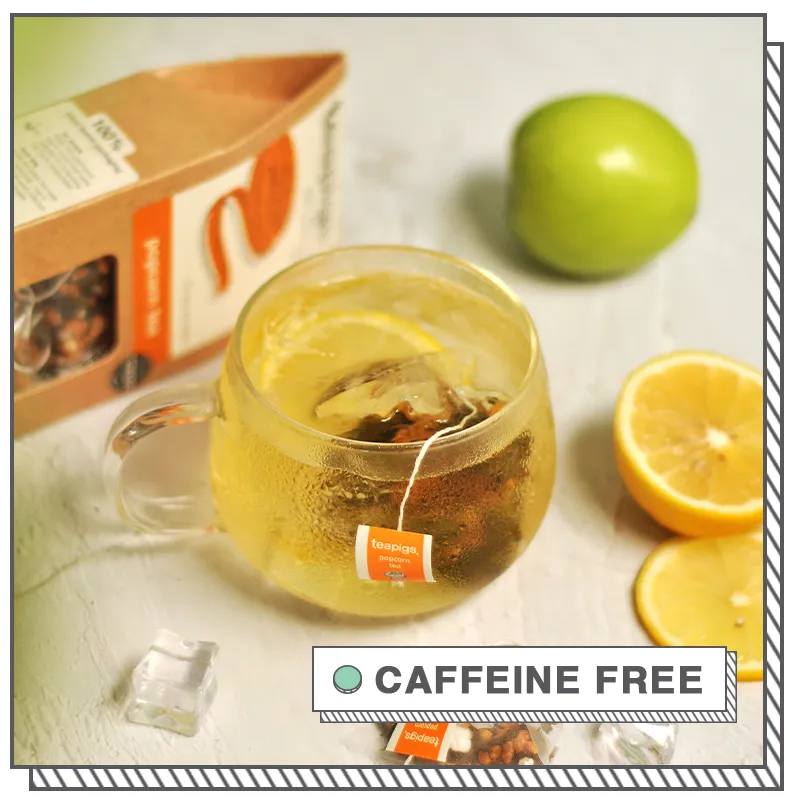
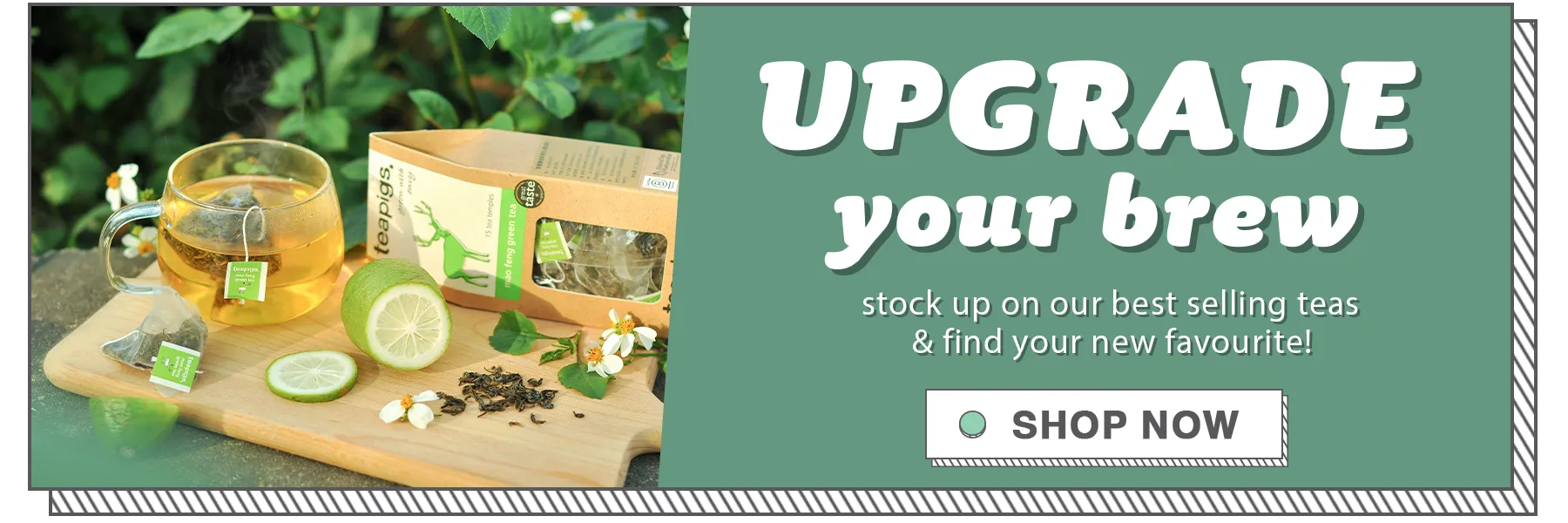
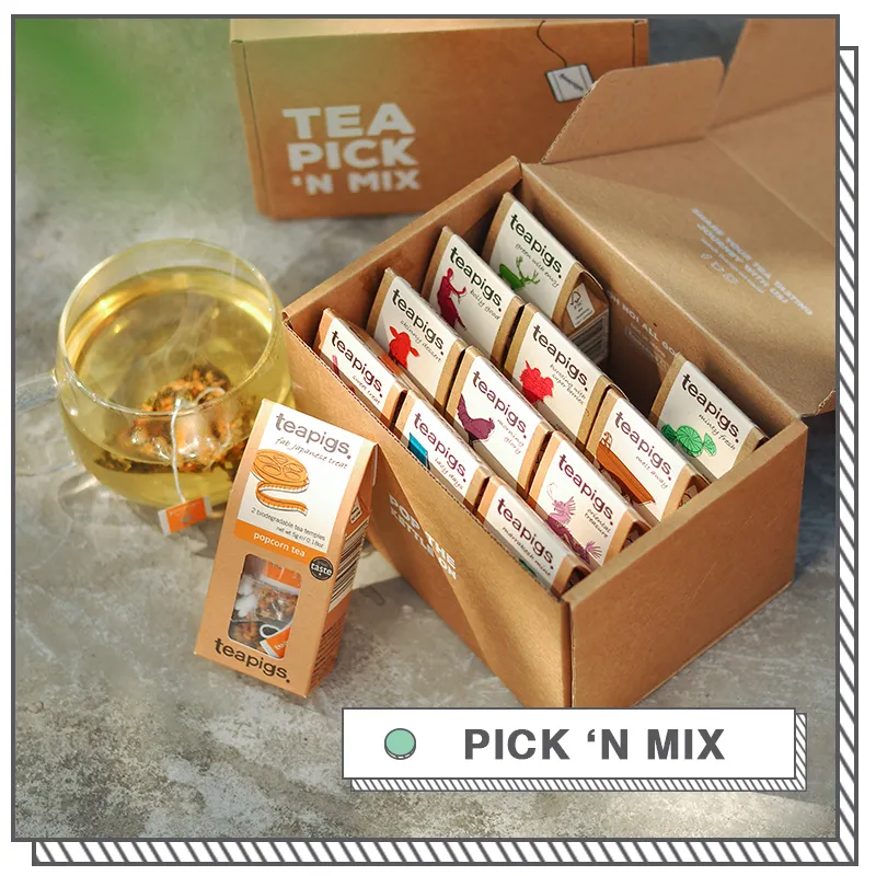
The design follows a Playful Minimalist aesthetic that mirrors the brand's sustainable roots. Utilizing a craft-paper texture as the primary background, the style emphasizes an organic, "plastic-free" feel.
Vibrant Color Coding: I implemented a bold, multi-color system to differentiate tea ranges (Core vs. Special), using the brand's signature hand-drawn illustrations to maintain a friendly and accessible tone.
Dynamic Layouts: For the web banners, I used sunburst patterns and comic-style "pop" outlines to create energy and movement, making the promotions stand out against the neutral cardboard textures.
Clear Typography: Using a chunky, sans-serif typeface with drop shadows, the information remains highly legible and professional while retaining a sense of fun and modernity.