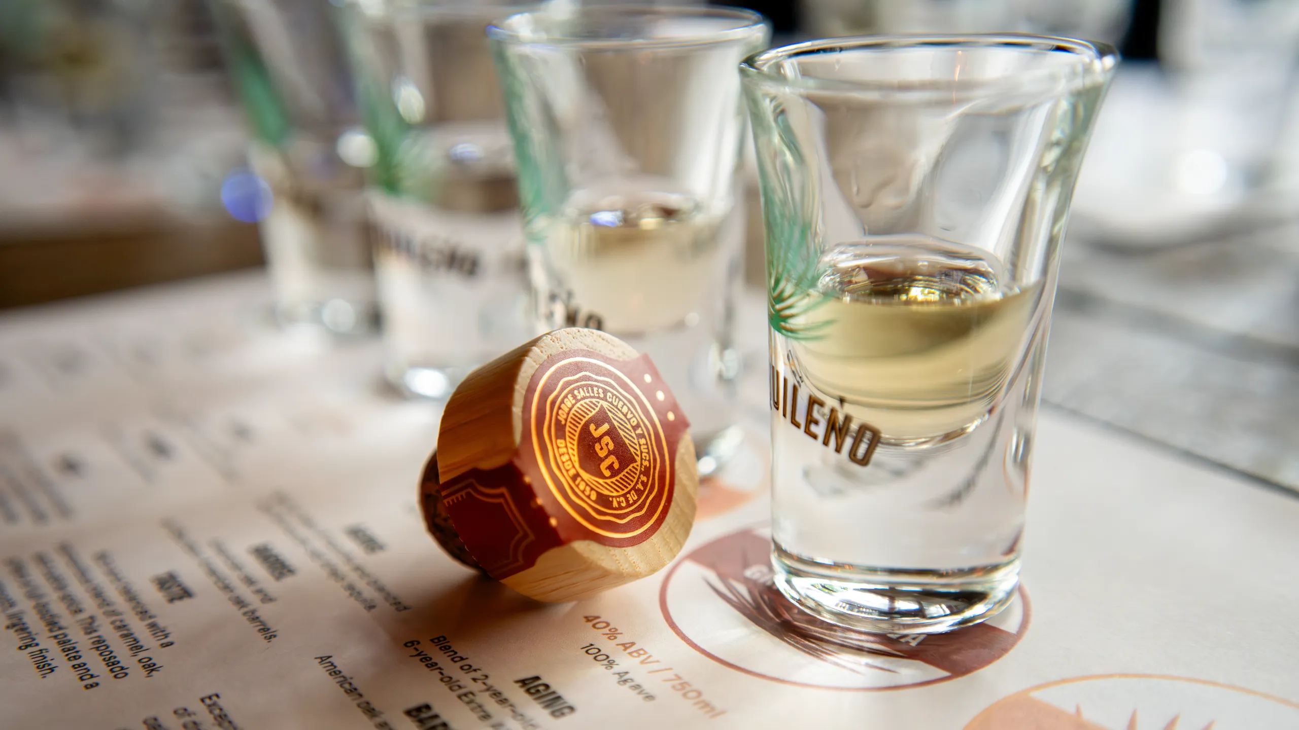
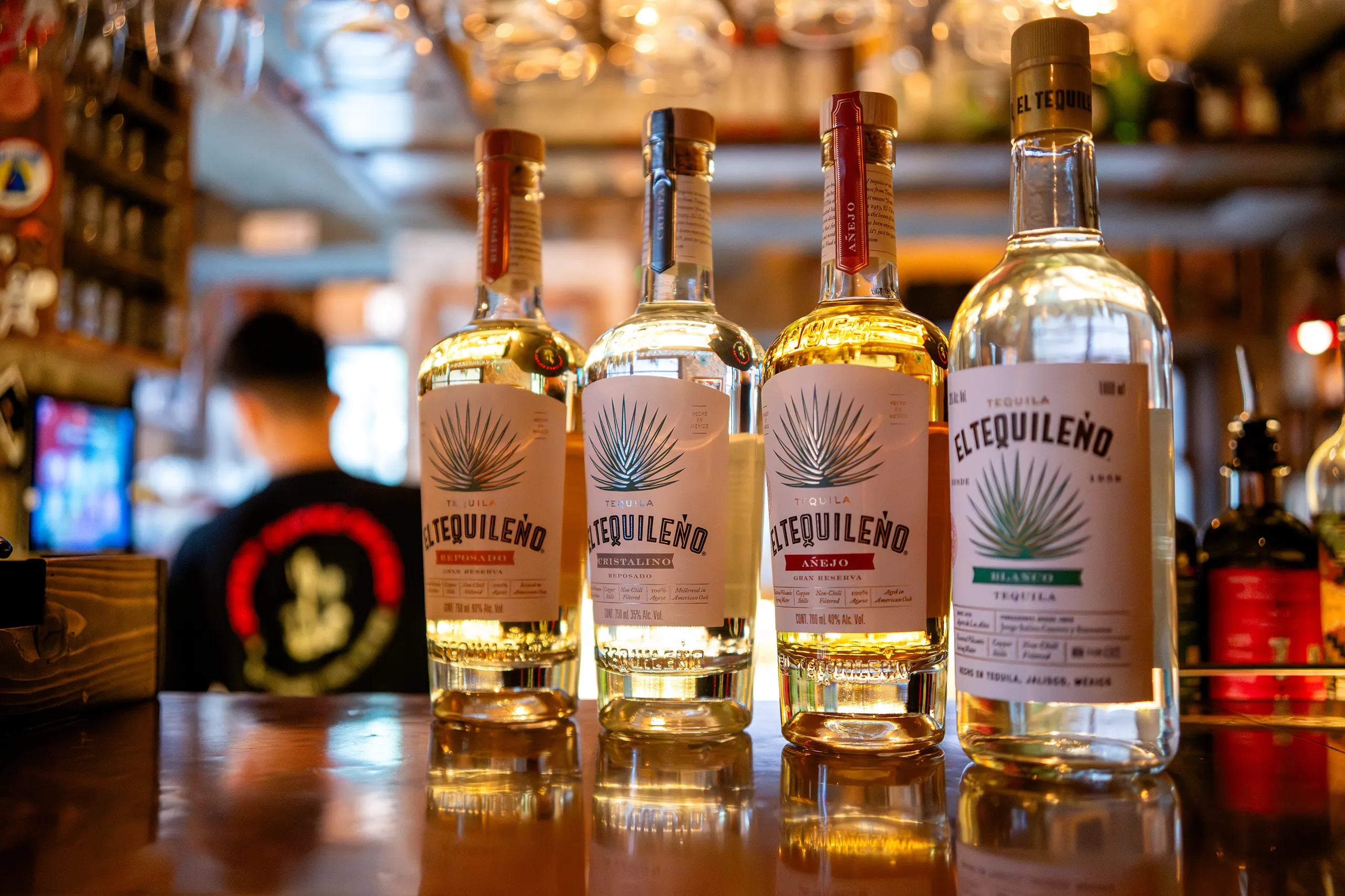
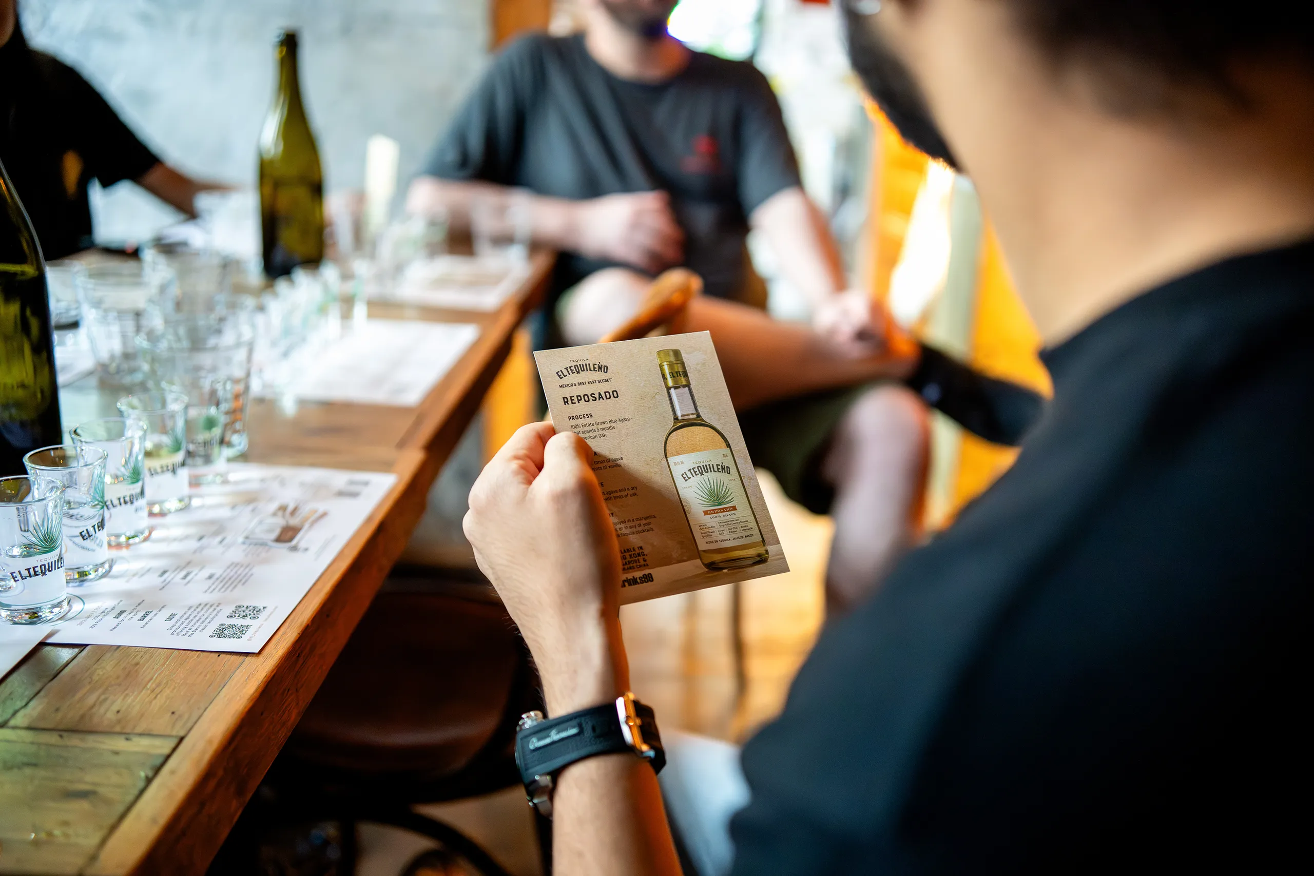
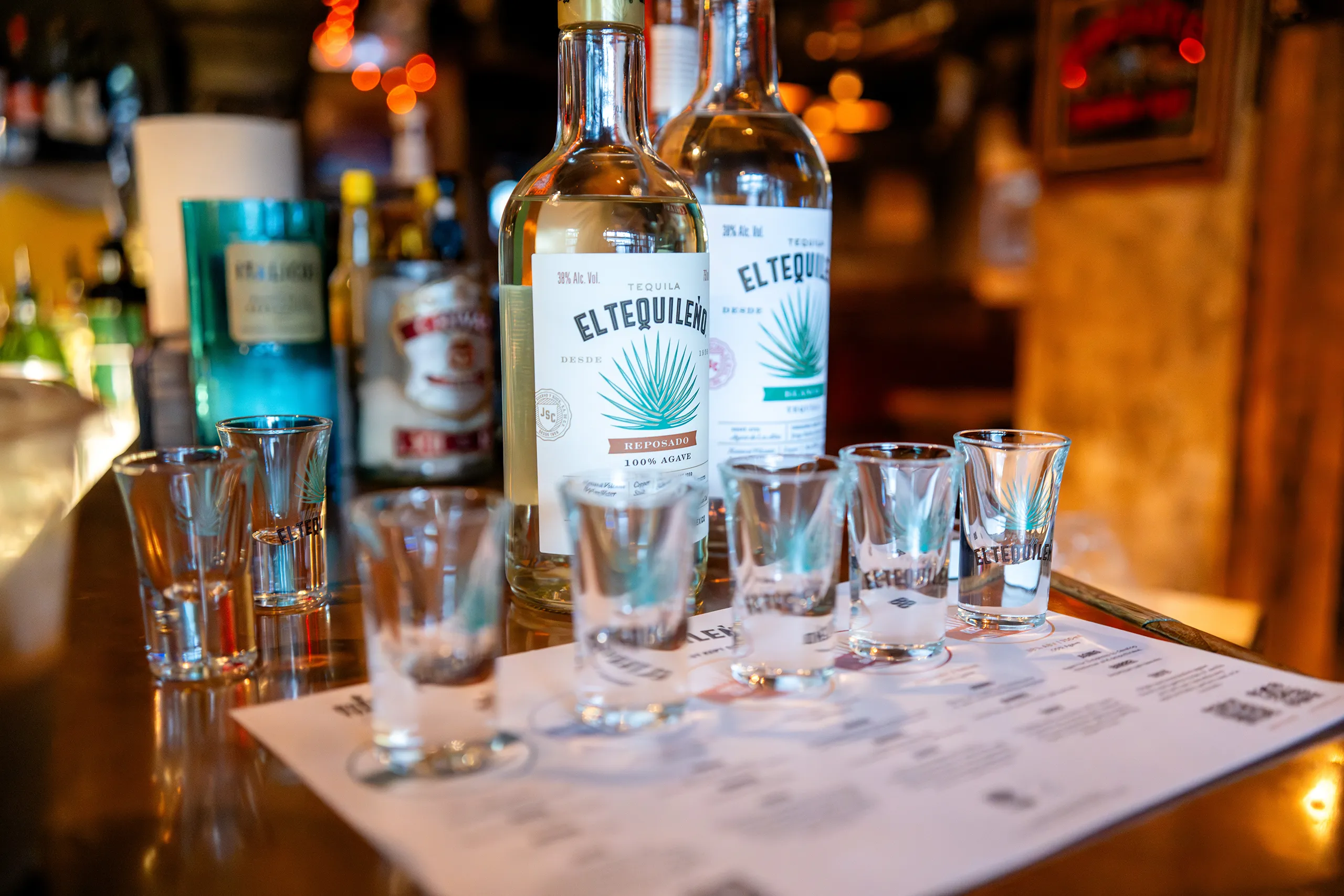
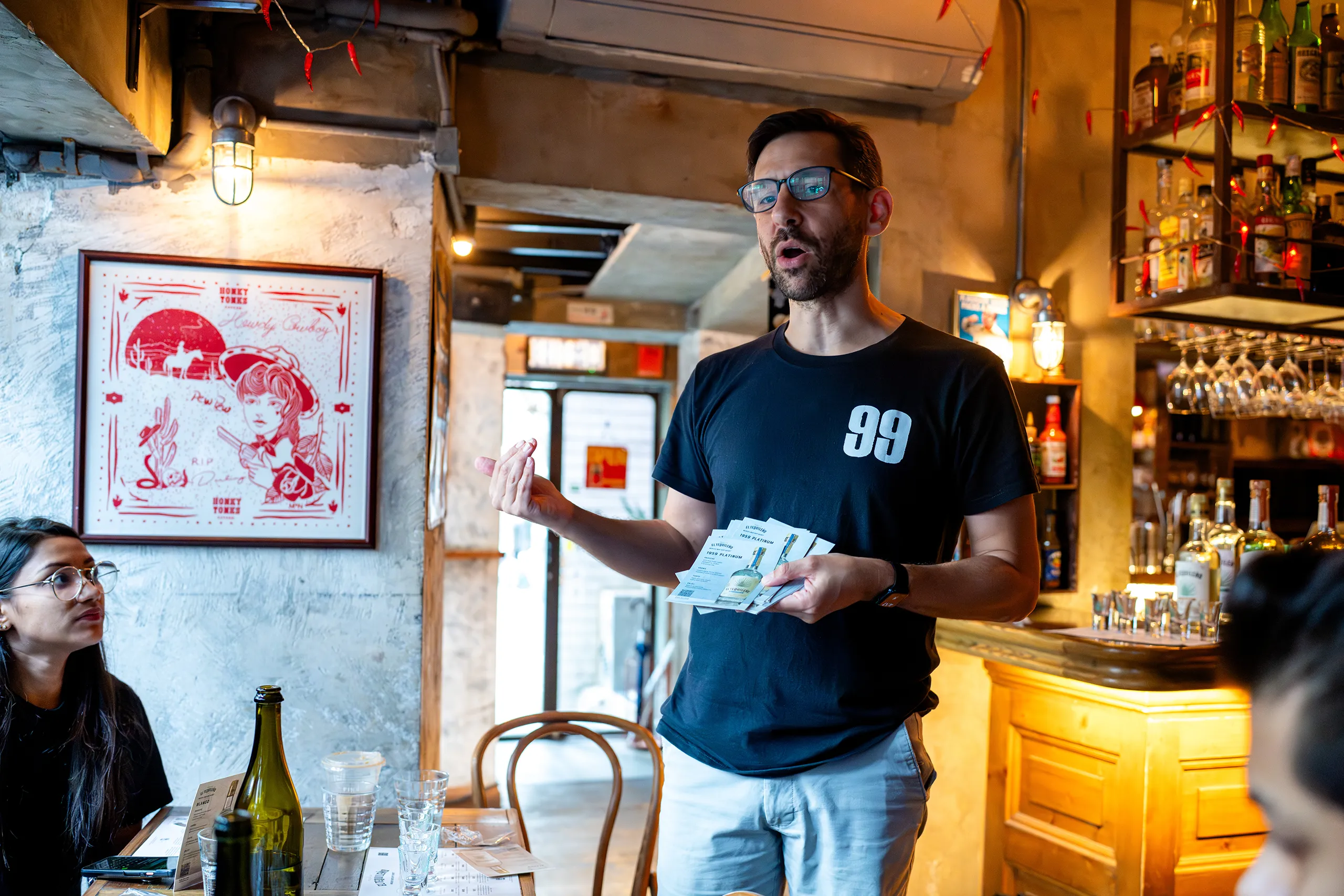
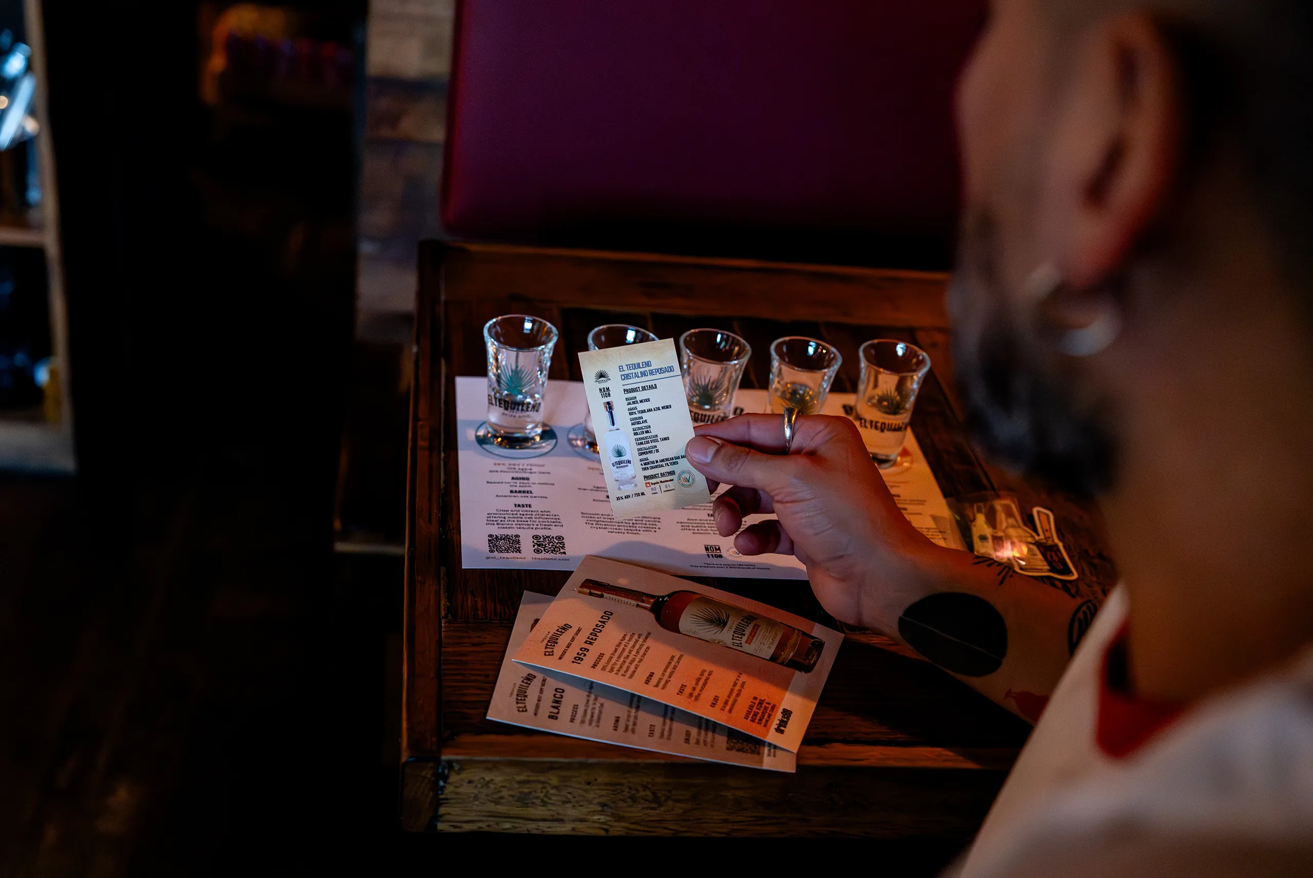
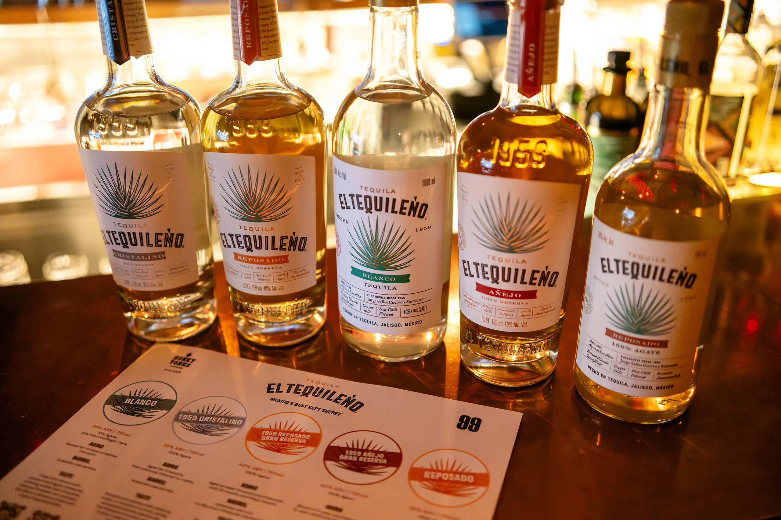
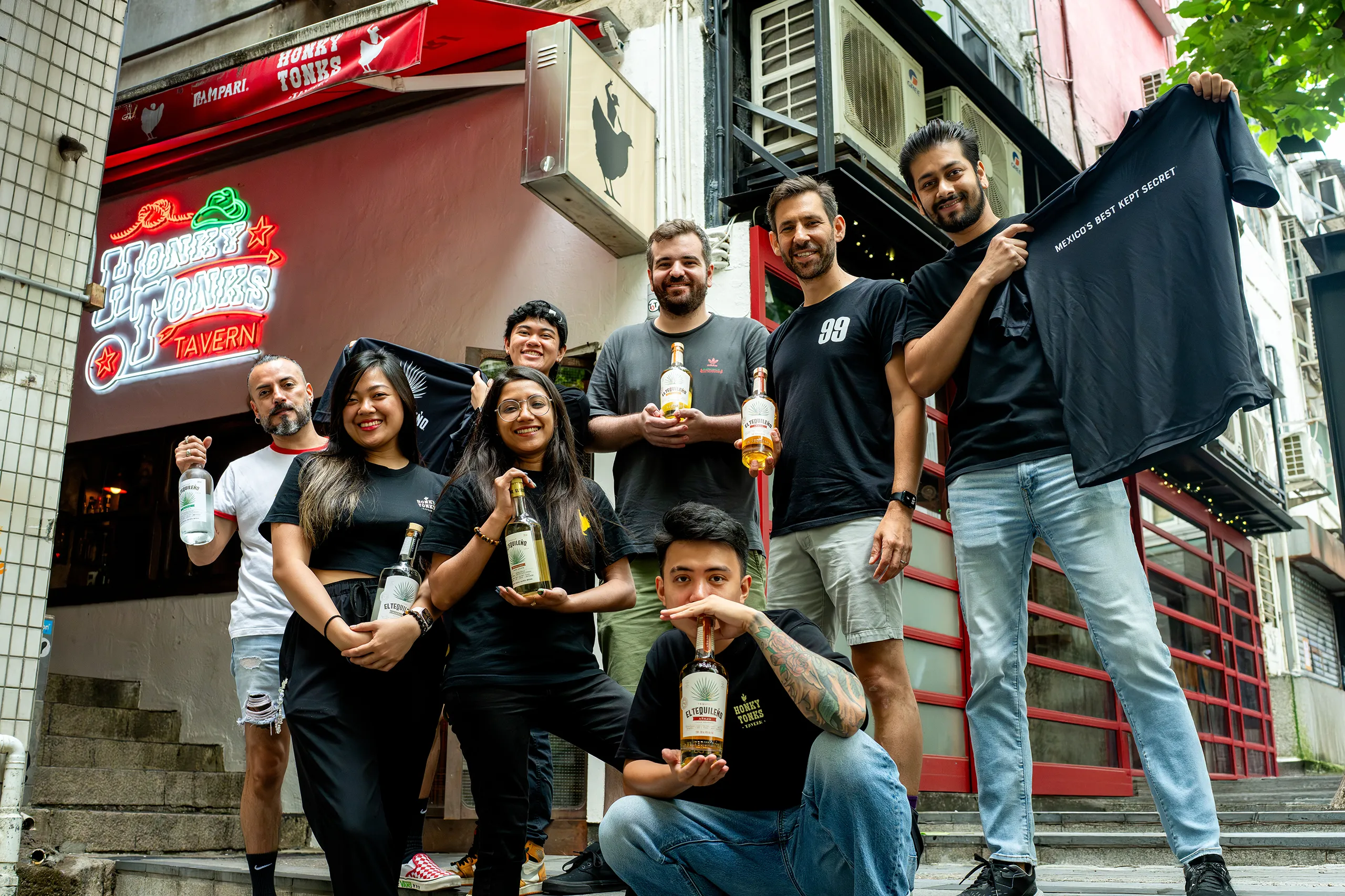
The design for this event centered on educational elegance. We utilized the "Sun Goddess" visual identity to create a series of premium postcards that served as both tasting guides and collectible keepsakes.
Key design elements include:
Tactile Brand Storytelling: The postcards feature bold, sun-drenched illustrations on the front, while the back provides structured tasting notes. This encourages guests to interact with the product on a deeper, more informed level.
Atmospheric Consistency: By using warm oranges, deep teals, and rustic textures, the collateral seamlessly integrated with Honky Tonk’s eclectic, dimly-lit interior, enhancing the premium feel of the night.
Functional Collateral: Beyond aesthetics, the cards were designed with a clean, legible hierarchy, ensuring that technical details about each tequila expression—from Blanco to Añejo—remained the focus during the tasting.