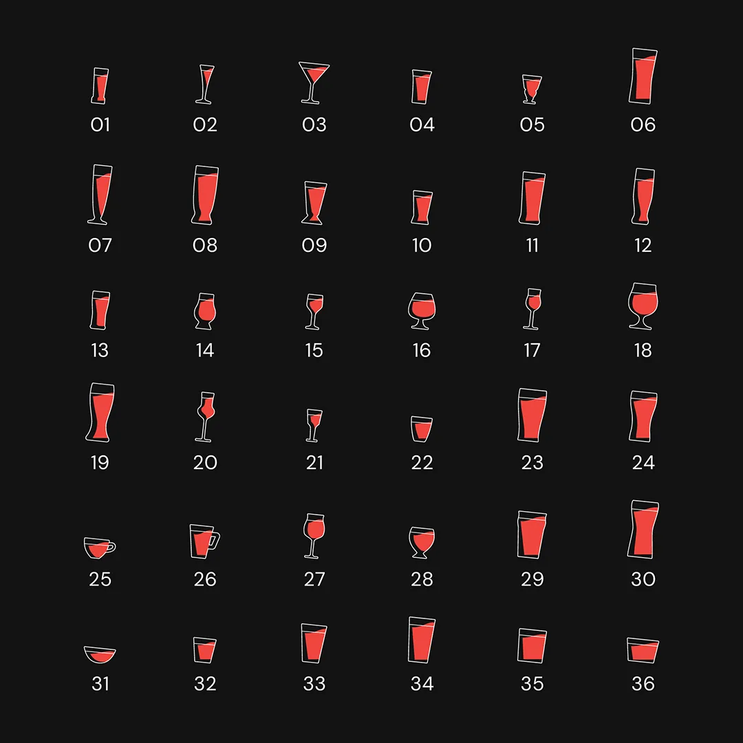
The visual identity is built on a foundation of Sophisticated Contrast. We established a signature palette of Deep Black and Bold Red to immediately communicate luxury and authority.
Key design features include:
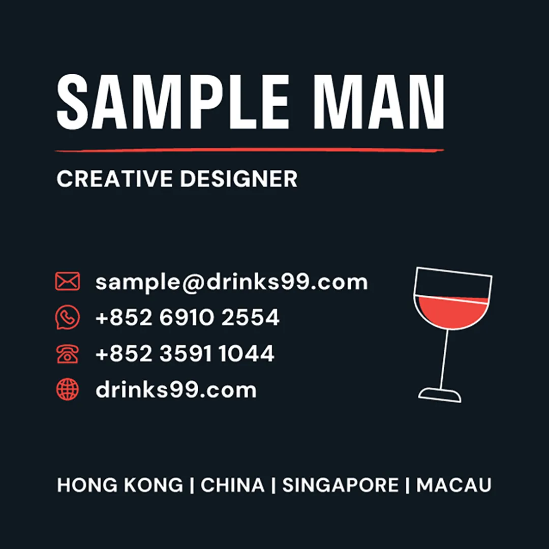
Purposeful Highlights: To contrast the clean, structured layouts, I introduced hand-drawn arrows and organic underlines in vibrant red. This adds a human, artisanal touch to the brand, much like a bartender’s personal recommendation.
Modern Typography: The use of bold, condensed sans-serif typefaces ensures that key information—like brand names and pricing—is highly legible and commands attention.
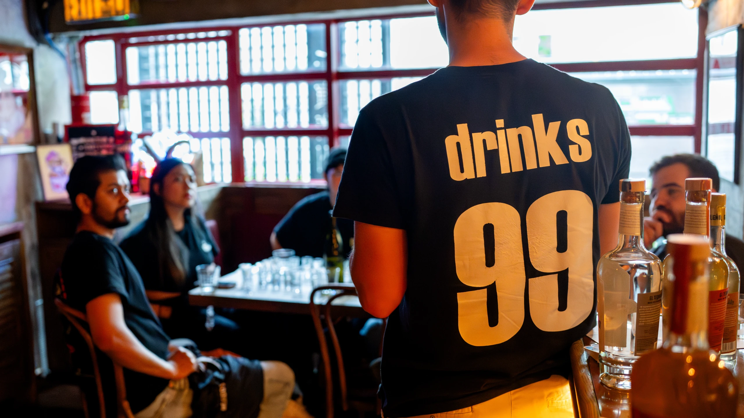
Imagery & Hierarchy: I utilized large, high-contrast photography of premium cocktails to evoke the sensory experience of the products, while maintaining a minimalist grid for technical data.