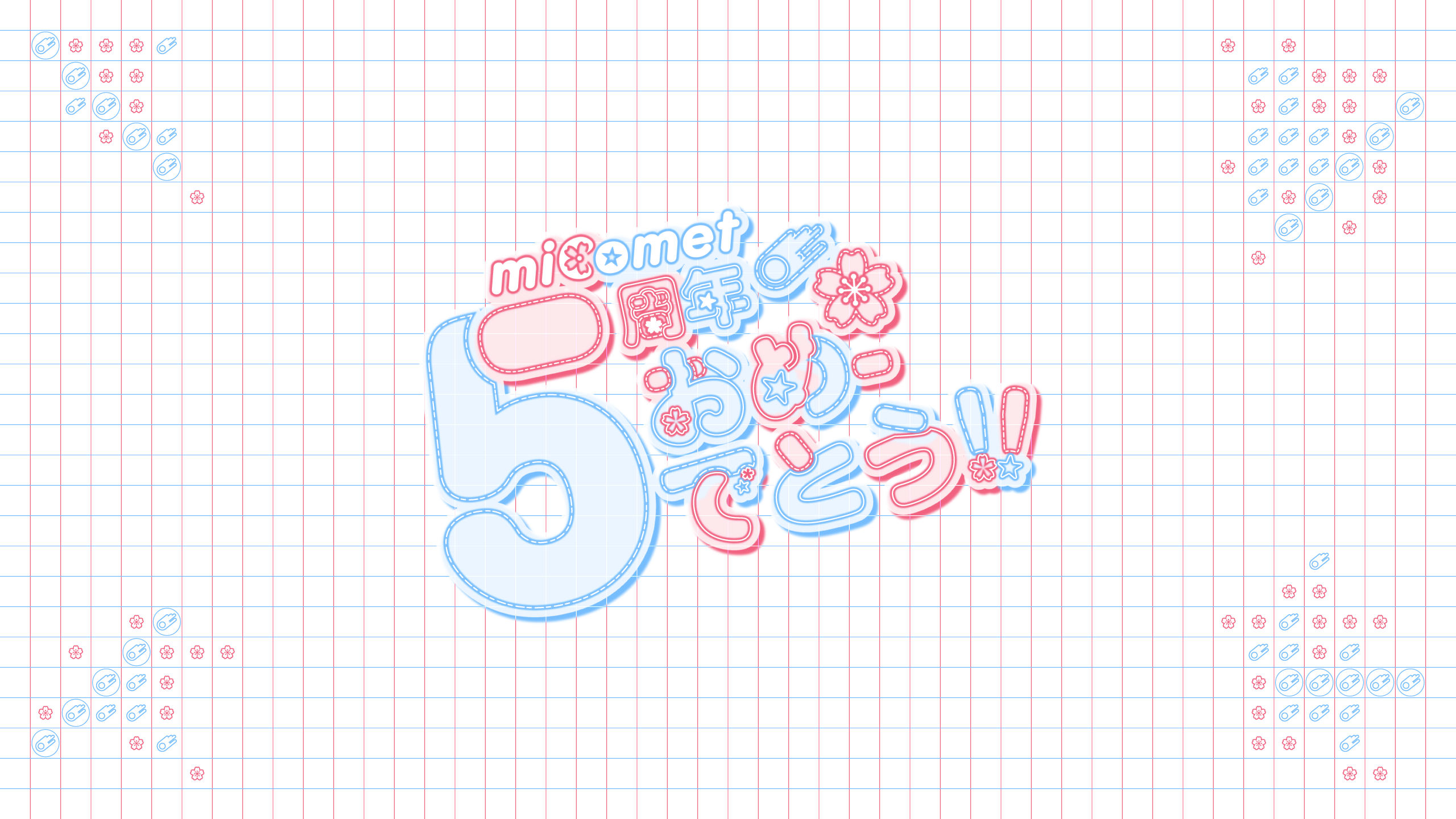
The design utilizes a dynamic complementary color palette, contrasting Hoshimachi Suisei’s cool cerulean blues with Sakura Miko’s warm cherry-blossom pinks, all set against a shimmering, star-filled navy background.
The typography is a standout feature; the large, stylized "5" and celebratory Japanese text use glowing neon outlines and playful bubble fonts to create a sense of depth and excitement. Strategic use of lens flares and sparkling particles enhances the "idol" atmosphere, while the grid-patterned borders provide a clean, modern frame. By balancing detailed character illustrations with bold, layered decorative elements, the composition successfully captures the duo’s "Business Partner" chemistry in an eye-catching, high-fidelity layout.